CHNNLS
An Instagram aggregating app that adds good intention to the algorithm.
Role
User research
Content strategy
UX writing
UI design
Usability testing
Scope
User research
Hi-fi prototype
Branding
Usability testing
Timeline
3-week design sprint
Research & Sketch
Decide & Storyboard
Prototype & Test
Tools
Figma
Notion
Maze
Google Surveys
* This was an independent creative project I ideated and conducted through Thinkful’s UX/UI Immersion Program.
Overview
The Problem Statement
Instagram is designed to be addicting, from the disorienting non-chronological algorithm to the instant gratification of micro-interactions.
The application prioritizes holding users' attention over all else and misses an opportunity to provide content organization solutions that could empower users to learn, be more inspired by others, and disseminate information for good.
Discovery—Get to know the users
Literature Review
Contrary to popular belief, the overwhelming majority of smartphone interactions are initiated by users, with only 11% prompted by notifications.¹
This makes it difficult to blame notifications for the near-constant disruption that is checking your phone. Ultimately, focusing on notification-design only is not a viable option to reduce smartphone interactions.
I approached this project with the hypothesis that retraining users under healthy design patterns could reduce the number of interactions while increasing their quality and user satisfaction.
This is important because in this study, users reported they were “dissatisfied with realizing how frequently and unintentionally these self-disruptions occur.”
Competitive Landscape
Most IG and social media extension software are made for Brands and Influencers.
No direct competitors were found, but the indirect competitors provided models and patterns that ultimately informed the creation of our final product.
Like To Know It
Influencers create shop-able posts in the third-party app and link to them in an IG post.
Sprout Social
Instagram management and content scheduling for business.
Instagram Desktop Extension
Upload photos and videos to Instagram right from your desktop. Direct Messages is fully supported. Download videos, photos and stories from Instagram to your PC or Mac.
PeopleMap
Brands can manage influencer lists and campaigns with software that uses the Instagram API to access account info as the CRM content. You can add notes to associated accounts that are saved across lists.
The Survey
I surveyed 12 people on their social media usage and habits and followed up with respondents to conduct 2 interviews.
The survey and interview results informed my design and helped me decide what type of digital product to create.
Two questions returned particularly valuable insights:
58% of respondents said they spend too much time on Instagram. Research has found that the scrolling features on apps like Instagram and Facebook lead to the longest smartphone interactions. This is referred to as “getting caught in the loop,” whereby the phone provides small amounts of satisfaction at a low cost.
This question was crafted to gauge intention. In Behavioral Change Theories, intention refers to the motivational factors that influence a given behavior where the stronger the intention to perform the behavior, the more likely the behavior will be performed. 83% of respondents reported that they often forget why they even open the app, which shows that their intention to complete a specific task is low and the interaction is habitual and automatic. This leaves their behavior vulnerable to manipulation once the app is open.
I want to design ways to break bad habits while maintaining user satisfaction.
The Interviews
I conducted 2 user interviews with the target demographic of women ages 18-25.
The main findings:
1. Users want to limit their screen time.
2. Users want a better way to save content they can come back to and reference later.
3. Users want to be able to curate their feed—one participant reported having multiple IG accounts for different types of content, like fashion influencers, brands, and memes.
4. Users want a chronological feed that doesn't mess with the content they are shown, like with the current algorithm.
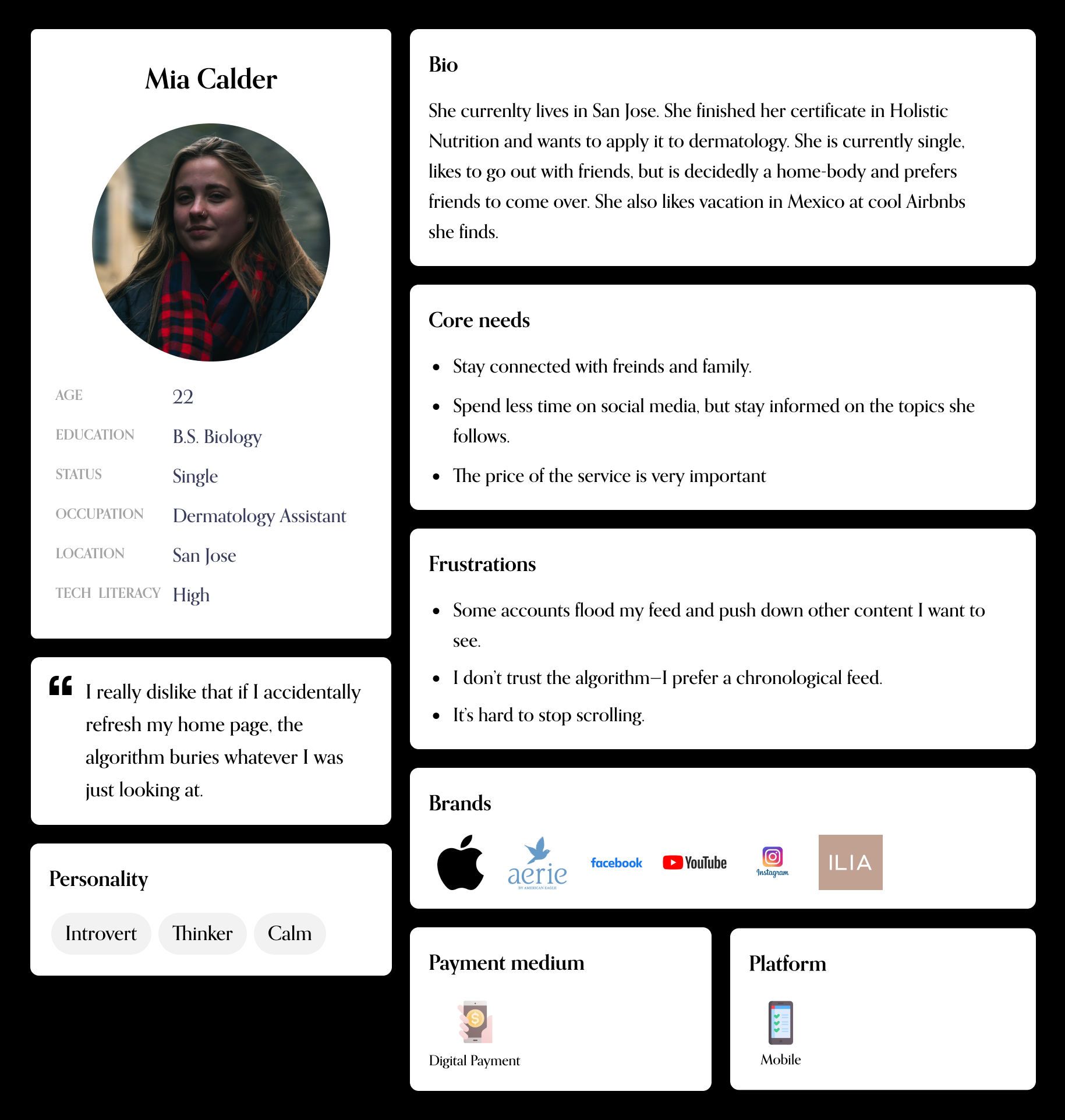
The Personas
My primary persona has pain points and goals that reflect target users—females between the ages of 18-25.
They experience feed fatigue and difficulty with putting their phones down once they are 'caught in the loop'.
The secondary persona has associated frustrations and concerns, but for his son of a younger generation, rather than himself. He is worried about his son developing unhealthy digital habits, which research has shown to be ingrained in childhood and set at puberty when neuron connections in the brain are pruned.
Define—Information Architecture
User Stories
I prioritized user stories, which helped me stay within scope.
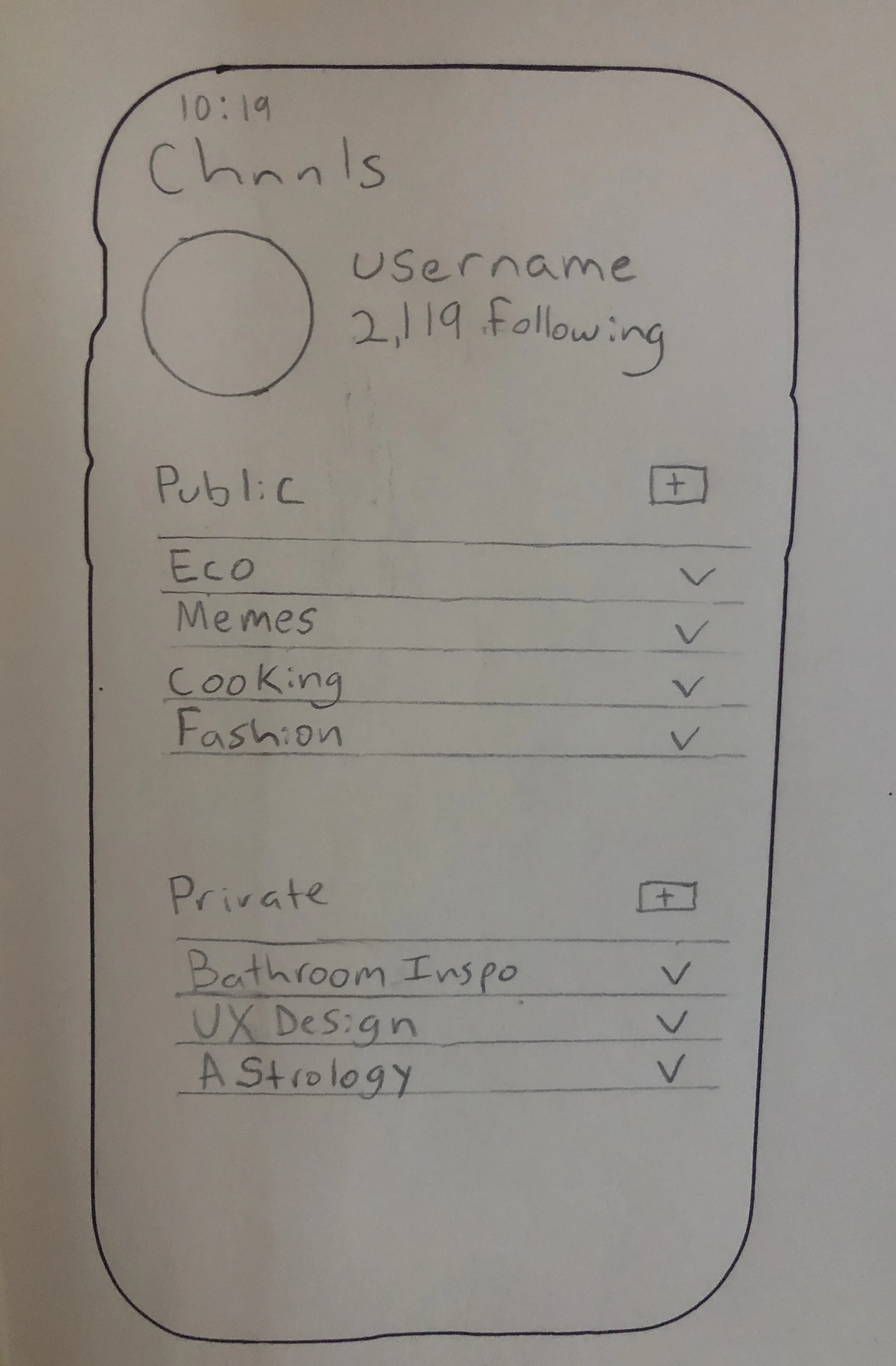
Sketches
I sketched out the new feed, profile, and search feature.
User Flows
I mapped the flow a user would take through the app to make sure the universal design principle of simple and intuitive use was met before I started building. Here is an overview of my user flow—each purple oval represents the launch of separate feature or user goal.
App Map
The app map I created helped me lay out exactly what content should go where.
Develop—Wireframes, Brand + Testing
Accessibility
Accessibility was top of mind—I applied universal design principles, like simple and intuitive use, and size and space for approach and use. I approached information hierarchy with a critical eye and made sure the most important information was discoverable. Matching users’ current mental models of Instagram also guided my design.
Wireframes
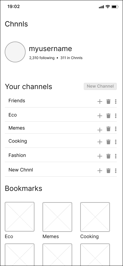
My first iteration of wireframes includes the 5 main screens: sign up, home, search, notifications, and the profile.
Sign up
Notifications
Home
Profile
Search
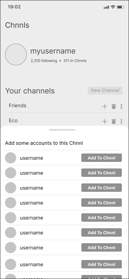
Following feedback about expected interaction outcomes, my second iteration of wireframes expanded on these screens to include interactions.
Home - Add to channel
Profile - Create new channel
Search - Add to channel
Home - Bookmarks
Profile - Add accounts to new channel
Search - Sort options
Home - Send in message
Profile - Channel added
The Brand
Young, playful, abstract. The target demo is a younger audience (18-25) who want to engage in healthy digital habits.
Playful abstract shapes don't take themselves too seriously and draw readers’ eyes across the page. For a generation that struggles with anxiety, these shapes can be soothing and less overwhelming than depictions of reality.
In Gestalt psychology, sharp, pointed shapes communicate something scary, like danger or pain. Meanwhile, round, amorphous, flowing shapes are perceived as safe and comforting—which is why I use them heavily in the branding and on the introduction screens.
Acumin is functional and clear for everyday display use. Druk Wide adds a strong typographic hierarchy for the logotype and headings. Romana for subheadings adds a necessary contrast to the ultramodern san serif fonts. The combination of a san serif, slab serif, and serif font create a balanced appearance on the screen.
Usability Testing
I conducted 2 moderated usability tests and used Maze to perform unmoderated usability tests with 17 participants.
Tasks
1. Swipe through the intro.
2. Create an account.
3. Watch a story.
4. Add a bookmark.
7. Add a new user to a channel.
6. Add a new channel.
5. Search for new eco accounts and add them to a channel.
8. Add someone you recently followed to a channel.
My Maze test resulted in an overall usability score of 71/100. Signing up proved to be simple and intuitive with a 100% success rate.
The search gave testers more difficulty in Maze but appeared intuitive during the moderated usability tests.
In follow-up questioning, I found that 90% of participants would download the app after testing.
"CHNNLS gives me Depop mixed with Instagram mixed with a modern Pinterest vibe. Super useful and such a good idea.”
— Anonymous Tester


